Wednesday, August 11, 2010

my kind of business casual


in the dream state of current day-to-day events where i desire a job but have yet to achieve employed status, i find my mind wandering into visions of business casual friendliness.  

these visions generally include me in a workplace  populated with people/objects all exuding a nature of trendy/drab/casual/structured/muted/tonal 

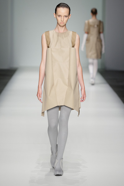
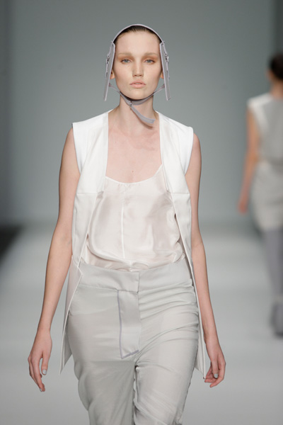
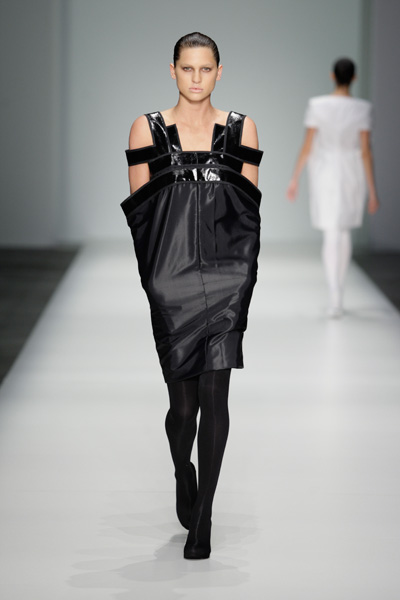
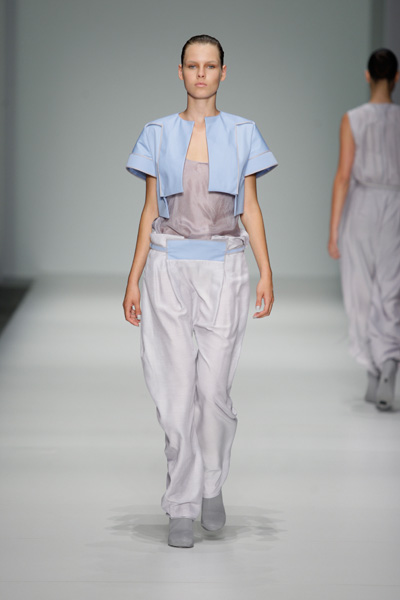
however, seeing as i am not currently a part of this environment i have the ability to browse the web to my pleasure and had an interesting vision today, in this first day of copenhagen fashion week [s/s11], the perfect essence of my glorified bureau musings courtesy of spon diogo, a duo based in copenhagen.  

spon diogo perfects the minimal shifts, embellished separates, and structured post-modern garments that i would love to sport at my very own deskspace.

perhaps now that i have found the desired wardrobe, the employment will follow...


all photos courtesy of 
Copenhagen Fashion Week®


Sunday, July 11, 2010

cross-training.

gael monfils and karlie kloss in vogue october 2009 "french open"

oftentimes, nationality is great issue of pride -especially on such a visible playing field, so to speak.  naturally, outward appearances are highly regarded and scrutinized [think: the dozens of spreads involving national team get-ups, and i really do mean get-up, for the most recent olympics opening ceremonies].  looks, colors, symbols and names are all a major aspect of the commitment and confidence of players and fans.

having attended university in a town where wearing a jersey or some other aspect of sports paraphernalia is considered "on trend," this pleasantry with and everyday acceptance of supporters for their teams always seemed like a cop-out in the what to wear department of the everyday. however, as the calm uruguayan ensemble strides alongside the neon-glo decked out dutch kit came to my realization that perhaps there is some semblance of structural bliss and stylistic nuance in the athletic uniform.

i decided to do some research to find out what kind of platform this fashionable perfomance wear this could be OR whether there were more to the uniforms of the multitudinous sports teams than just a color, advertisement, and insignia.  in other words, i decided to actually excavate the colors, meanings, and structures of the shirts/shorts/pants/skorts to see if there were more relevance between fashion+design and athletic uniforms.


take, for instance, the australian athletic colors -the "green and gold-" have no relevance to their flag; but, they have come to stand for even more than just athletics as a color scheme when paired together.  though many athletic teams strive to have a tough mascot or a daunting nickname, this green and gold that can only signify one thing for many people, australian citizen or not, apparently symbolizes the colors of their floral emblem, the golden wattle.  more than a galvanizing name [ie, cameroon: the indomitable lions], it is the colors that australian players and fans take pride in; it is these visual aspects of the team that perpetuate athletics and cause people to keep an eye for the jerseys, kits, and caps of their favorite teams.

pantone 116Cand pantone 348C

due to the impending [now played...this post is going up late :( ] world cup finals, i recently had some musings involving the crossing of platforms between the sports and fashion worlds.  we see all sorts of connections between these different realms of culture including photo-spreads and spokesperson contract extended to sports stars, like the example above with gael monfils gracing the pages of us vogue last fall and sports themed high-fashion editorials.  however, as evidenced by recent collections, the sports world has left more of a mark than simply fit bodies and roguish good looks.

a new york times fashion and style article from wednesday discusses the very question of the branding and modeling crossover roles that many stars [in particular soccer stars] tend to accept and the amount of brands who use these familiar faces -and bodies-for representation. conversely, many magazines,stylists, and photographers choose to use sports as a theme of editorial spreads.  we often see the juxtaposition of "tough" and disciplined athletic garb, form and function executed by supermodels.

furthermore, many influential brands and design houses choose to become synonymous with their home country and strive to create iconic pieces, uniforms, and goods especially for their national teams.  dolce & gabbana's sartorial support of the italian  soccer team, fifa's commission of louis vuitton design services in trunk form, and ralph lauren's overzealous polo customization for the usa 2010 winter olympic squad all come to mind...


which brings me to my final thought spurred by the ss2010 runway seasons from both alexandre herchcovitch and alexander wang of the inspiration which actual athletic uniforms and equipment lend to the high fashion world.

herchcovitch, in an interview published on his website gives this statement in regards to his choice of sporting gear as inspiration:::

       <> (from his website)

Alexandre Herchcovitch Spring 2010 Ready-to-Wear

Alexandre Herchcovitch Spring 2010 Ready-to-WearAlexandre Herchcovitch Spring 2010 Ready-to-WearAlexandre Herchcovitch Spring 2010 Ready-to-WearAlexandre Herchcovitch Spring 2010 Ready-to-WearAlexandre Herchcovitch Spring 2010 Ready-to-Wear
all above photos from alexandre herchovitch ss2010

i'll leave you with alexander wang's iconic jersey, sheers, and leather layers with the faint hint of the structure of past american football uniforms and headgear...  elegantly layered and structured with a clear idea of using these shapes to accentuate the feminine form:::


 AWNG_SS10_0044  AWNG_SS10_0095  
AWNG_SS10_0113

Thursday, June 24, 2010

new and much improved.

after the year-long hiatus of the experiencing the ex-pat life in the antipodes, the blog will soon continue.  the much-desired visual update to the blog is here and so the words may flow.

seeing as the internet situation left much to be desired, i place importance on trying to stay as unplugged as possible while in australia.  though this exercise allowed my mind to expand in many ways and for the long hours needed to take advantage of the beautiful west australian weather and landscapes, it also hindered my creative forays.  everyone enjoys the alone time that they receive in bouts of "outdoorsiness," but then too, they enjoy the creativity of being able to practice and relish the individual tasks and meanderings that make up a person's avocations -that which one does for sheer pleasure.

writing escaped me in the antipodes amongst other things.  i have come to reclaim my still fervent delectation with punching keys and vocalizing thoughts.

here's to a return to inward individualism.

Thursday, July 23, 2009

perfection-ary confectionery

as its amsterdam international fashion week and i am nowhere near -but have increasingly become obsessed with benelux/northern european emergences...

the confectionery pleasures of elsien gringhuis displayed after this first day of amsterdam catwalks ss10 have truly tempted me. not only has gringhuis kept her flow of separates at a level of diversity and wearability that reaches to the public with all sorts of personal style aesthetics, but she has kept the collection recognizable. the silhouettes stay constant to the themes that she has shown in the past, but with a softer and sweeter facade. gringhuis, who won the hema (a belgian retail organisation) sustainable design competition in the fashion category for 2008 and the createurope best avantgarde design for 2008 (their first year of competition), is a still relatively recent graduate of arnhem academy of art and design in the netherlands. a dutch school that generally produces interesting, solid graduate collections.

i really adore the collection's avoidance of true, bright colors as the pieces lend themselves well to molding and creating defined silhouettes stylistically speaking. sorry for the alliteration! but honestly, the slightly "ladies who lunch" feel of the collection with the to-the-elbow debutante gloves (which i could absolutely argue are the best everyday choice of gloves. ever.) and the color palette is so accessible and pliable for all types of buyers and consumers. a delightfully simple but fun collection all in all.


photos courtesy of team peter stigter

perhaps i will find myself requestion mum to let me dust off those very debutante gloves and getting to square shapes of cropped jackets and shift dresses for this coming spring/summer (which where i am isn't too far off now...)

in other news, posting will again pick up, as i have found a new place on which to ground myself...hints on where in the world that may be to follow....

Wednesday, June 24, 2009

the long goodbye.


to borrow from the altman film noir classic in title only -don't be fooled, this post has nothing to do with tijuana or private detectives.

it goes more like this:::

leaving has been a long process for me thus far.
clocking in at just over three weeks in south carolina i have lately been trying to develop lists of things i'd like to do before leaving again. the list is something that i can remember since i was
smaller. i have always felt that making a list is a great security for all occasions::: to get tasks done that need doing before something else occurs, to reassure against possible memory failings, to make desires and ideas known...

therefore, i have been compiling a list of truly stereotypical "americanisms" to do before i leave the south. in asking the boy what i thought were some tried and true american things to him (being of another nationality), he replied with that of course hamburgers, hot dogs, french fries and pizza were. naturally, these were some of the first things i wrote down on my list. realism was really my goal for the fulfillment and creation of this list. until now, i had only been capable of crossing off "apple pie," "watch college baseball game on a tv in a bar that serves bud light on tap and in bottles" and "pizza."

however, today mum strolled into the house while i was in the throes of viewing la dolce vita -yes the powerful, beautiful, and profound fellini masterpiece (ahhhhhh the costumes! sigh for the embellished flower-petal-like collared capes at the aristocrats in the countryside party and nico, period) only to plop down these on the table in front of me...


like a blast from that self-same childhood past where my obsession with lists is rooted, rush's fast food made its way back into my memory. i'm not here to suggest that you should know what rush's is or that i'm overly sentimental about a fast-food restaurant. the chain is a local to my city in south carolina restaurant and the only things i can really have anymore due to the vegetarian diet are the perfectly salted and crispy french fries and the delightfully (still) handmade chocolate milkshakes. behold. but, it used to be a favorite indulgent after-school snack on an occasional friday in mum's old van.

so, i snapped a picture of the midafternoon lunch/snack because in all honesty, how awesome are those graphics? unlike so many other brands, restaurants, and stores rush's has stuck to the same graphics they've used since probably the 1960's and personally, i'm a fan. besides who doesn't love a motto like "fabulous food...fast." essentially i'm honored that mum surprised me with rush's as a way to help me check off two more things "chocolate milkshake" and "french fries" on my most recent of lists.

enjoy!

to check out a beautiful advertisement from the '90s, direct yourself to rush's homepage here.